In mid December I finally got the opportunity to visit the (in-)famous
French capital. Being the urban planning geek I am, I couldn’t help
noticing some interesting usability-improving signage and
installations in the Paris Métro:
Usability improvements
Numbered exits
Being one of the oldest metro systems of the world, with notoriously
labyrithic stations, this simplifies certainly helps finding your way
to your meeting point. My friends would often tell me to meet them at
exit number 2, or whatever. Unfortunately, the exits aren’t numbered
at street level, and you have to pass the turnstiles to see the
pictured exit map.


Without this feature, how do you make appointments at behemoth
stations like the Kottbusser Tor station in Berlin? (Of course, the
answer is simple in this example: You meet in front of Kaiser’s like
everyone else, but how are you supposed to know that when you’re new
to the city?)
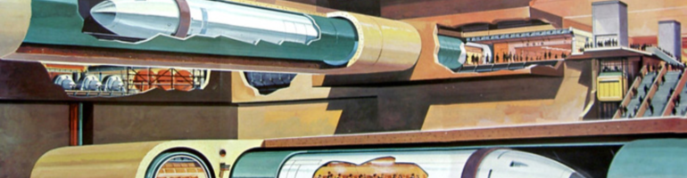
Station Tracker
Platform screen-doors
Supposedly preventing suicides, the screen-doors are even more
important on well-used platforms during rush hour, to prevent
people from falling, being pushed or dropping things on the tracks. This also allows the
station to cater to an increasing amount of travellers without expensive expansions of the train platforms.

Anti-Usability-features
Turnstiles
They make quite a horrible sight, and how utterly tasteless to post
advertising on the exit doors. As previously written on Betongelit
(in Swedish), turnstiles don’t necessarily reduce fare evasion. Though
arguably, removing turnstiles where they’ve existed for a long time
(not sure if this has ever been done), could probably cause a fare
evasion surge. Note that the turnstiles seem to be effective, even
against terrorism threats (those cheap bastards!), when it’s suitable to say so. Absence of turnstiles is rather the exception, and therefor
it’s hard to withdraw too many points for these.
Hardly any center platforms
For easier change of direction if necessary. The advantages of
centered train platforms are mentioned in this post, though
some of them are negated by the fact that only one line traffics
one set of tracks and platforms in the Paris Métro.
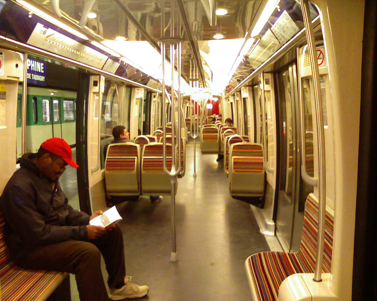
Anti-Usability verging on misantropy: Benches
When metro station seats are renewed, the benches are typically replaced by individual seats, so that ”someone cannot lie down or
occupy more than one” as one blogger so euphemistically put it. Now, I
have a hard time imagining that the need for a personal space is that
large in a country where the standard greeting, even for people you
meet for the first time, consists of kissing each other’s cheeks (try
scandinavian countries, perhaps).
Of course, this is the ”design” solution for the classical ”problem” of
homeless people trying to get somewhere to sleep instead of freezing
to death on the streets. An inhumane and technocratical solution to a
social problem, performed by concious- and spineless industrial designers,
making the nooks and crannies on the street level of the Centre Pompidou
seem like an explicit social statement made by Richard Rogers and
Renzo Piano at the time.
Author: Jonas Westin

Ping: Den gäckande ändstationen | Arbetsbok